My #1 priority when it comes to designing a website is to make it CLEAR. And you know what can really mess with that?
Fonts
Choosing the wrong font, making it the wrong size, using it in the wrong place… there are so many ways that font choice can ruin the clarity and readability of your website.
The good thing about font choice is that you can follow some simple rules, and get it right every time! So I’m going to share my list of rules with you in this post.
Make your fonts large enough… but not too large
Here’s a starting point:
Paragraphs – 16px minimum
Depending on your font, you may want to try 18px
Headings – don’t go larger than 55px
If you make the headings too big, the scale looks off
Script – needs to be bigger than you think to make it readable. Try 37px – 50px.
Choose a scale and stick to it
Visually, your brain wants to see a consistent scale.
Try 3:4 – each step up is .75x larger than the one before (ex/ 16 – 21 – 28 – 37 – 50)
So it might look like this for your website:
Paragraph – 16
Subheading – 28
Script – 37
Headings – 50
Leave enough space between lines
Try a 1.6 ratio. If your text is 16px, the line spacing is 26px
Don’t use too many fonts
Two fonts is enough. Yes, really.
Choose 1 font for headings and 1 for paragraph text.
Use larger sizes of the paragraph text (with variations like all caps, or italics) for subheadings.
If you must, you can add a script font – to be used VERY sparingly!
The consequence of using too many fonts is a site that looks totally DIY.
Use google fonts
They’re free and they work well on all devices. If you want to use a fancy custom font, go ahead and use it in your logo. But don’t make the mistake of splashing that font around everywhere on your site – it will lose its impact.
Always check that your font is readable on BOTH desktop and mobile
There’s nothing worse than falling in love with a font and then realizing that it’s basically unreadable on mobile. Look at the size and the spacing. Increase both to make it more readable!
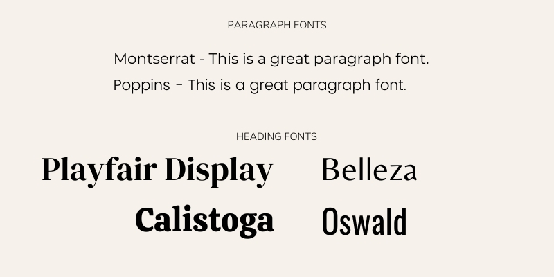
BONUS: my favorite google fonts
Paragraph fonts:
Montserrat
Poppins
These are both super simple and readable and they work well with many different heading fonts.
Heading fonts:
Playfair Display – for a classic look
Calistoga – for a boho look
Belleza – for a sophisticated look
Oswald – for a minimal look

Have fun updating your fonts. Follow this guide to make your website fonts clear and readable, and avoid the traps that make your website look DIY!

